Resets
Explanation
External stylesheets
Root
@keyframes smoothscroll1 {
	from,
	to {
		scroll-behavior: smooth;
	}
}

@keyframes smoothscroll2 {
	from,
	to {
		scroll-behavior: smooth;
	}
}

html {
	animation: smoothscroll1 1s;
	block-size: 100%;
	font-size: max(1em, 20px);
	text-size-adjust: none;

	/* scrollbar-gutter: stable both-edges; */

	&:focus-within {
		@media (prefers-reduced-motion: no-preference) {
			animation-name: smoothscroll2;
			scroll-behavior: smooth;
		}
	}
}
If the user is okay with motion smooth scrolling it set.
The animations disable smooth scrolling when searching the page. This ensures that user’s are able to hop around the search results on the page without being slowed down by scrolling animations.
It’s useful for the <html> element to fill the viewport, even when empty.
Larger more accessible root font size, if the user’s default font size is less than 20px then the root font size will be 20px but if the user’s font size is bigger than that then the root font size will match their font size value.
Removed scrollbar-gutter until this Chromium bug is fixed. When fixed we’ll be able to wave goodbye to layout shift when opening modals.
body {
background-color: var(--Canvas, Canvas);
color: var(--CanvasText, CanvasText);
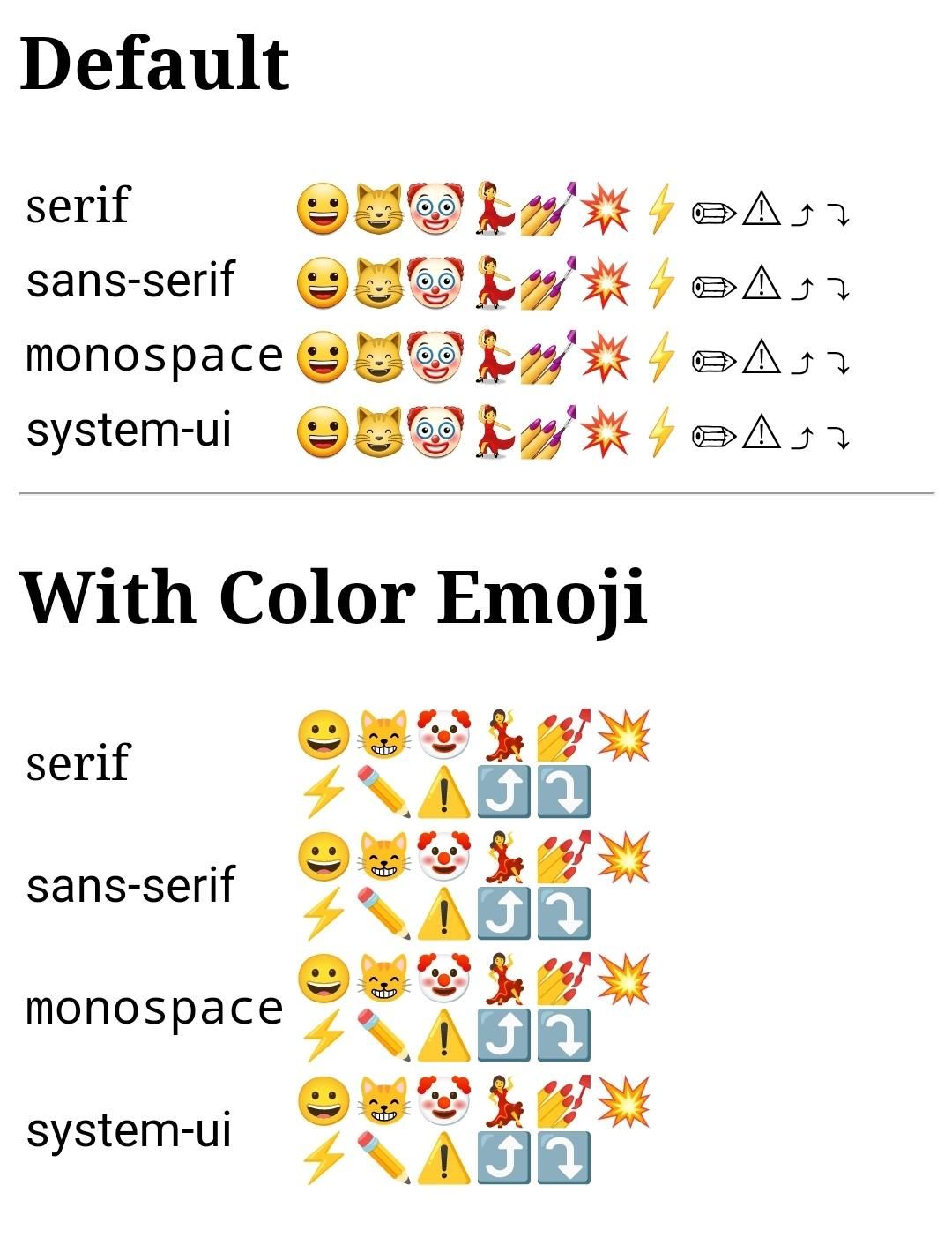
font-family: system-ui, sans-serif, "Apple Color Emoji", "Segoe UI Emoji",
"Segoe UI Symbol", "Noto Color Emoji";
min-block-size: 100%;
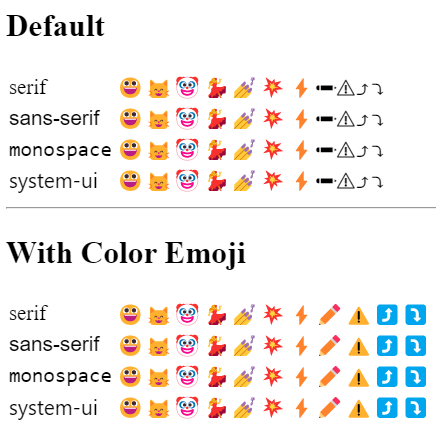
}We’re using system colours, see the colours section on the tokens page for more details.
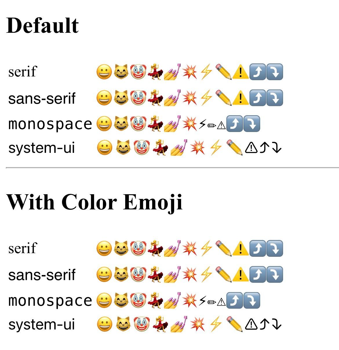
System font stack
Viewport height
::selection {
	background-color: var(--Highlight, Highlight);
	color: var(--HighlightText, HighlightText);
}
Selection colours
[hidden] {
	display: none !important;
}
Hide hidden elements
A11y
:focus-visible {
	outline: medium solid var(--Highlight, Highlight);
}
Clearer focus styles
[aria-pressed="true"] {
	border: medium solid;
}
Not 100% sold on this one, but I do like the idea of indicating aria-pressed by default.
:is(
		summary,
		label[for],
		label:has(input),
		select,
		button,
		input:is([type="checkbox"], [type="file"], [type="radio"], [type="range"])
	) {
	cursor: pointer;
}
Pointer cursor on elements that are interactive.
::-moz-range-thumb {
	cursor: grab;

	&:active {
		cursor: grabbing;
	}
}

::-webkit-slider-thumb {
	cursor: grab;

	&:active {
		cursor: grabbing;
	}
}
Graby hand cursor for the range input.
Had to duplicate the above code because we can’t use :is()/:where() for a forgiving selector as they don’t support pseudo elements.
:is(
		input[disabled] + label[for],
		label[for]:has(+ input[disabled]),
		label:has(input[disabled]),
		[disabled]
	) {
	cursor: not-allowed;
	color: var(--GrayText, GrayText);
}
Not allowed cursor and disabled text color for disabled elements and labels of disabled inputs.
The input + label setups that the selector matches:
<input disabled><label for></label><label for></label><input disabled><label><input disabled></label>
Type
h1,
h2,
h3,
h4,
h5,
h6,
p,
li {
	overflow-wrap: break-word;
	text-wrap: balance;
}
Break really long words to avoid overflow.
Not yet well supported, so this is a progressive enhancement to avoid orphans and widows.
a {
	color: var(--LinkText, LinkText);
	-webkit-tap-highlight-color: transparent;

	&:visited {
		color: var(--VisitedText, VisitedText);
	}

	&:active {
		color: var(--ActiveText, ActiveText);
	}
}
Link colours
Removing Webkit’s tap highlight
mark {
	background-color: var(--Mark, Mark);
	color: var(--MarkText, MarkText);
}
Mark colours
Blocks
* {
	margin: 0;
	padding: 0;
}
Removing all margin and padding
table {
	border-collapse: collapse;
	width: 100%;
}
Responsive tables
th,
td {
	border: thin solid var(--CanvasText, CanvasText);
}
Table cell borders
pre {
	overflow: auto;
}

pre code {
	hyphens: none;
	tab-size: 4;
	white-space: pre;
}
Preformatted text blocks scroll and don’t break text, also set a sensible tab size.
p:empty {
	display: none;
}
Hide empty paragraphs
Forms
button {
	background-color: var(--ButtonFace, ButtonFace);
	border-color: var(--ButtonBorder, ButtonBorder);
	color: var(--ButtonText, ButtonText);
	font: inherit;
}
Button colours and font fix.
textarea {
	display: block;
	font: inherit;
	min-height: 6em;
	min-height: 6lh; /* Not yet well supported, so keeping in a fallback for now */
	resize: vertical;
	resize: block; /* Not yet well supported, so keeping in a fallback for now */
	width: 100%;
}
Font fix
Width
Resizing and min height with progressive enhancements
fieldset {
	border: 0;
}
Remove the fieldset border
input:not([type="checkbox"], [type="radio"]),
select {
	display: block;
	font: inherit;
	width: 100%;
}
Font fix
Width
input:is([type="tel"], [type="text"]),
textarea,
select {
	background-color: var(--Field, Field);
	border: thin solid var(--FieldText, FieldText);
	color: var(--FieldText, FieldText);
}
Field colours
button,
input:not([type="checkbox"], [type="radio"], [type="file"], [type="range"]),
select,
textarea {
	border-style: solid;
}
Solid borders
input[type="range"][orient="vertical"] {
	appearance: slider-vertical;
	writing-mode: bt-lr;
}input:is([type="checkbox"], [type="radio"], [type="range"]),
progress {
accent-color: var(--SelectedItem, SelectedItem);
}Accent colour
input:is([type="checkbox"], [type="radio"], [type="range"])[id] ~ label[for],
label:has(input:is([type="checkbox"], [type="radio"], [type="range"])),
label[for]:has(
		~ input:is([type="checkbox"], [type="radio"], [type="range"])[id]
	) {
	color: var(--SelectedItemText, SelectedItemText);
}
Sets the label text colour for any of the following situations:
<label for></label><input id><input id><label for></label><label><input></label>
::placeholder {
	color: var(--GrayText, GrayText);
}
Placeholder text is the same colour as disabled text.
::file-selector-button {
	background-color: var(--ButtonFace, ButtonFace);
	border-color: var(--ButtonBorder, ButtonBorder);
	border-style: solid;
	color: var(--ButtonText, ButtonText);
	cursor: pointer;
	display: block;
	font: inherit;
	width: 100%;
}
This rule contains a lot of duplicate code from certain above rules because we can’t use :is()/:where() for a forgiving selector as they don’t support pseudo elements.
Media
img,
video,
audio,
iframe,
picture {
	aspect-ratio: auto var(--ratio);
	height: auto;
	max-width: 100%;
}
aspect ratio variable
auto height
maximum width
video,
iframe {
	--ratio: 16 / 9;
}
set the aspect ratio variable for certain elements
svg {
	fill: var(--fill, var(--svg, currentcolor));
	stroke: var(--stroke, var(--svg, currentcolor));
	stroke-width: 0;
}
currentcolor for fill and stroke
remove stroke width on the svg element
[data-icon] {
	display: inline-block;
}
Helper attribute for making an img or svg behave more icon like.
Example
See the Pen PDS Styles CSS Reset by Elly Loel (@ellyloel) on CodePen.